Customizing CSS Themes
A CSS theme is the foundation of your visual identity in Branding by Aulasneo. It defines the colors, typography, spacing, and any global CSS overrides that will be applied across your Open edX site. Themes are compiled into CSS files and served to the Open edX Micro-Frontend (MFE) layer at runtime.
Creating a Theme
Navigate to Themes in the main navigation.
Click New Theme.
Enter a unique, descriptive name. The name is used internally and does not appear to end users.
Configure the sections described below.
Click Save Core Theme when finished.
Color Palette
The color palette section defines the raw color values for your theme. These are the foundational colors from which semantic colors and component colors are derived.
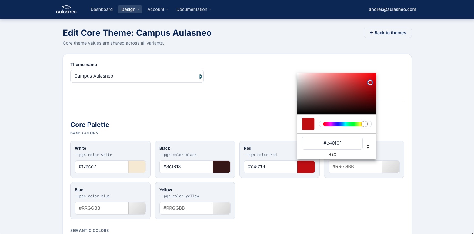
The palette section lets you define the base colors using color pickers or hex values.
The following palette colors are available:
Field |
Description |
|---|---|
|
The lightest color in your palette. Used as the default background and for high-contrast text on dark surfaces. |
|
The darkest color. Used for text and high-contrast surfaces. |
|
Base red used for danger and error states. |
|
Base green used for success states. |
|
Base blue for informational elements. |
|
Base yellow for warning states. |
|
The primary brand color. Used for the most important interactive elements such as primary buttons and links. |
|
A secondary accent color complementing the primary. |
|
The main brand identity color, typically matching your organization’s primary brand color. Used in headers, navigation, and branded components. |
|
Color for informational messages and callouts. |
|
A first accent color for use in custom or extended components. |
|
A second accent color for additional visual variety. |
You can enter colors as six-digit hex values (e.g., #3a7bd5) or use the built-in
color picker. Leaving a field empty will cause the theme to inherit the Paragon default
for that variable.
Semantic Colors and Core Metrics
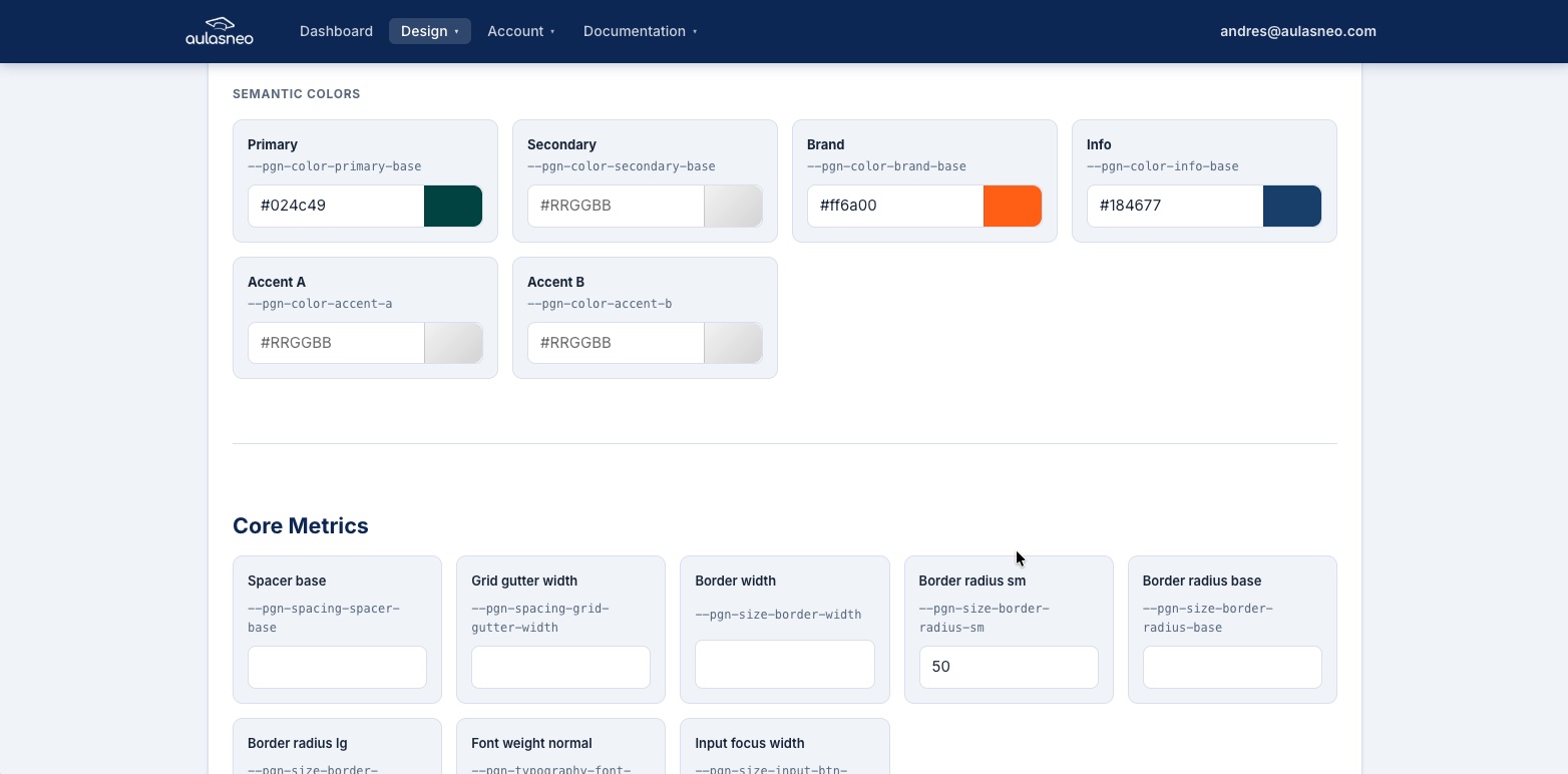
Semantic colors and geometry metrics allow fine-grained control over layout and component appearance.
Core Metrics are non-color style properties that affect layout and geometry:
Field |
Description |
|---|---|
|
The base spacing unit (in pixels) used throughout the grid and components. |
|
The horizontal spacing between grid columns. |
|
The default width of borders on components such as cards and inputs. |
|
Border radius for small elements (e.g., badges, small buttons). |
|
Default border radius for most components. |
|
Border radius for large elements such as modals. |
|
The default font weight for body text (typically 400). |
|
The width of the focus ring drawn around focused input fields. |
Typography
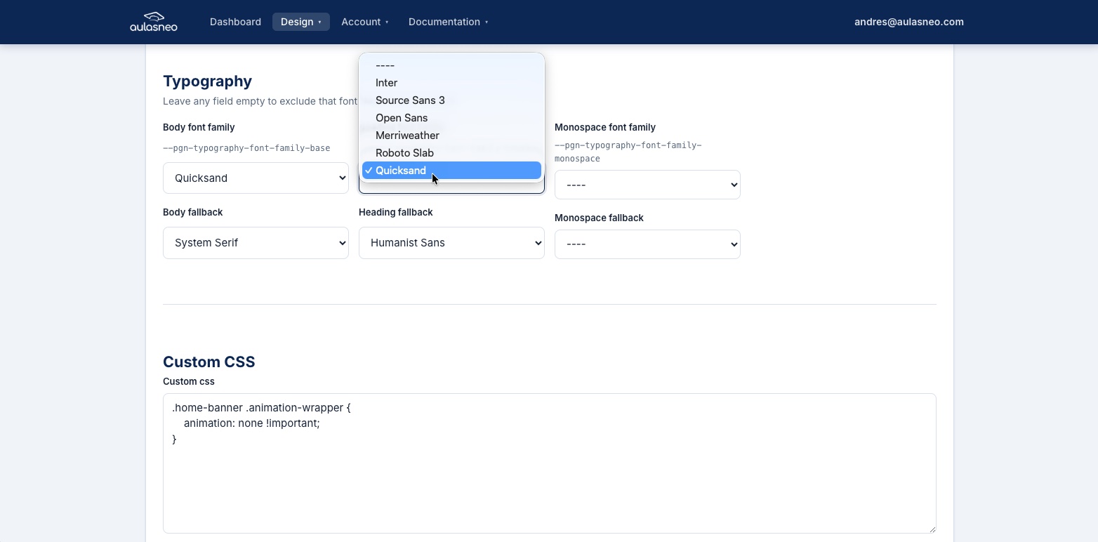
The Typography section allows you to specify font families for body text, headings, and monospace contexts.
The following font family fields are available:
Field |
Description |
|---|---|
|
The font stack for body text throughout the platform. |
|
The font stack used for heading elements (H1–H6). |
|
The font stack for code, keyboard, and pre-formatted text. |
Font families are specified as CSS font stacks — a comma-separated list of font names with fallbacks. For example:
"Open Sans", Arial, sans-serif
If you are using a custom font, add the font files to a font set first (see
Adding Custom Fonts), then assign it here using the drop-down list. System fallbacks such as
Arial, Helvetica, or sans-serif should always be included at the end of the
stack to ensure legible rendering when the custom font cannot be loaded.
Note
If you plan to use a custom font as the monospace font, verify that the font includes a monospace variant. Using a proportional font in monospace contexts may produce misaligned code or terminal displays.
Custom CSS Overrides
The Custom CSS field accepts raw CSS that is injected into the theme at the global level, after all Paragon variables are applied. This is useful for overriding styles that are not controlled by Paragon variables.
Example — removing the animated welcome banner on the home page:
.home-banner .animation-wrapper {
    animation: none !important;
}
Warning
Custom CSS is not validated before injection. Incorrect CSS can break the appearance of your site. Always test changes in a staging environment or use your browser’s developer tools before saving.
For more information on using custom CSS effectively, see Advanced CSS Styling.
Copying a Theme
If you want to create a new theme that is similar to an existing one, use the Copy action in the theme list. Copying a theme duplicates:
All palette and metric values.
All typography settings.
All theme variants and their overrides.
All custom Paragon properties attached to the theme and its variants.
All custom CSS from the theme and variants.
The copy is created as an independent theme with no link to the original. Changes to one do not affect the other.
Note
Copying a theme is subject to your plan’s theme count limit. If you are at the maximum number of themes allowed by your subscription, the copy action will be blocked until you delete an existing theme or upgrade your plan.
Deleting a Theme
To delete a theme, click the Delete button in the theme list or theme editor. Note that a theme cannot be deleted if it is currently referenced by an active build. Remove or update the relevant build before deleting the theme.