Understanding the Style Map
The Style Map is an interactive reference catalog built into Branding by Aulasneo
that displays all Paragon CSS custom properties (--pgn-* variables) used by Open edX,
together with their default values and interdependencies. It is an essential tool for
understanding how visual properties relate to each other before making changes.
The Style Map provides a graph-based view of Paragon variable relationships, showing which variables reference other variables.
Accessing the Style Map
Navigate to Style Map in the main navigation menu. The style map is available to all authenticated users regardless of subscription plan.
What the Style Map Shows
The style map distinguishes between two types of Paragon variables:
- Value variables
Variables that are assigned a direct CSS value, such as a hex color (
#0d6efd), a pixel measurement (4px), or a named color (transparent). These are the “leaf” nodes of the dependency tree — changing one of these values has a direct and predictable effect on the visual property it represents.- Reference variables
Variables that are defined using the CSS
var()function, pointing to another Paragon variable. For example:--pgn-color-warning-base: var(--pgn-color-yellow);
When you trace the dependency chain, reference variables form a tree. Changing a parent variable propagates the change to all descendants.
Reading the Style Map
Each entry in the style map shows:
The full variable name (e.g.,
--pgn-color-btn-text-outline-warning).The default value (either a literal value or a
var()reference).Any variables that depend on this variable (downstream references).
The variable(s) that this variable itself depends on (upstream references).
This information allows you to answer questions like:
If I change the primary color, what else will change?
Which variable controls the border color of focused inputs?
Why is the warning button text a particular shade of yellow?
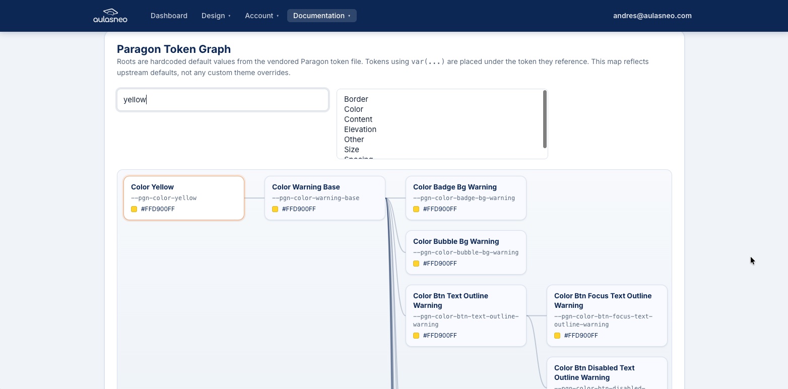
Practical Example
Consider the following excerpt from the Paragon variable hierarchy:
--pgn-color-yellow              → #ffc107
    └── --pgn-color-warning-base  → var(--pgn-color-yellow)
            ├── --pgn-color-btn-text-outline-warning
            │       → var(--pgn-color-warning-base)
            ├── --pgn-color-btn-focus-text-outline-warning
            │       → var(--pgn-color-warning-base)
            └── --pgn-color-btn-disabled-text-outline-warning
                    → var(--pgn-color-warning-base)
In this example:
Changing
--pgn-color-yellowupdates--pgn-color-warning-baseand, transitively, all three button state colors.Changing
--pgn-color-warning-baseupdates the three button state colors without affecting other uses of yellow.Changing
--pgn-color-btn-text-outline-warningaffects only that one button state.
Note that --pgn-color-bubble-bg-warning would not be affected by changing
--pgn-color-warning-base, because its definition references a different parent
variable.
Using the Style Map with Custom Properties
The Style Map is designed to be used alongside the Custom Paragon Properties feature. Once you identify a variable that controls the appearance you want to change, you can add it as a custom property in the relevant theme or variant.
The Style Map is also useful for verifying that a variable is actually used by the current Open edX frontend. Variables that exist in Paragon’s source but are not referenced by any MFE component will have no visible effect when changed.
Data Sources
The style map is built from data derived from the @openedx/paragon npm package,
specifically from the compiled Paragon light theme CSS. The variable list and default
values reflect the version of Paragon in use by the current Open edX release supported
by the platform. If your Open edX installation uses a different Paragon version, minor
discrepancies in variable names or defaults may exist.
For the authoritative list of Paragon variables, refer to the official Paragon repository at https://github.com/openedx/paragon/.