Custom Paragon Properties
Custom Paragon Properties allow you to override any Paragon CSS custom property
(--pgn-* variable) that is not exposed through the standard theme form fields. This
mechanism gives you complete control over the visual appearance of every component in the
Open edX Micro-Frontend layer.
What Are Paragon Variables?
Paragon is the component library used by Open edX. It defines hundreds of CSS custom
properties — prefixed with --pgn- — that control colors, spacing, typography, shadows,
transitions, and other visual attributes of every UI component. When you change a Paragon
variable, its effect propagates automatically to all components that reference it.
Custom properties can be attached to either a CSS theme (applied globally) or a specific theme variant (applied only in that mode, e.g., only in dark mode).
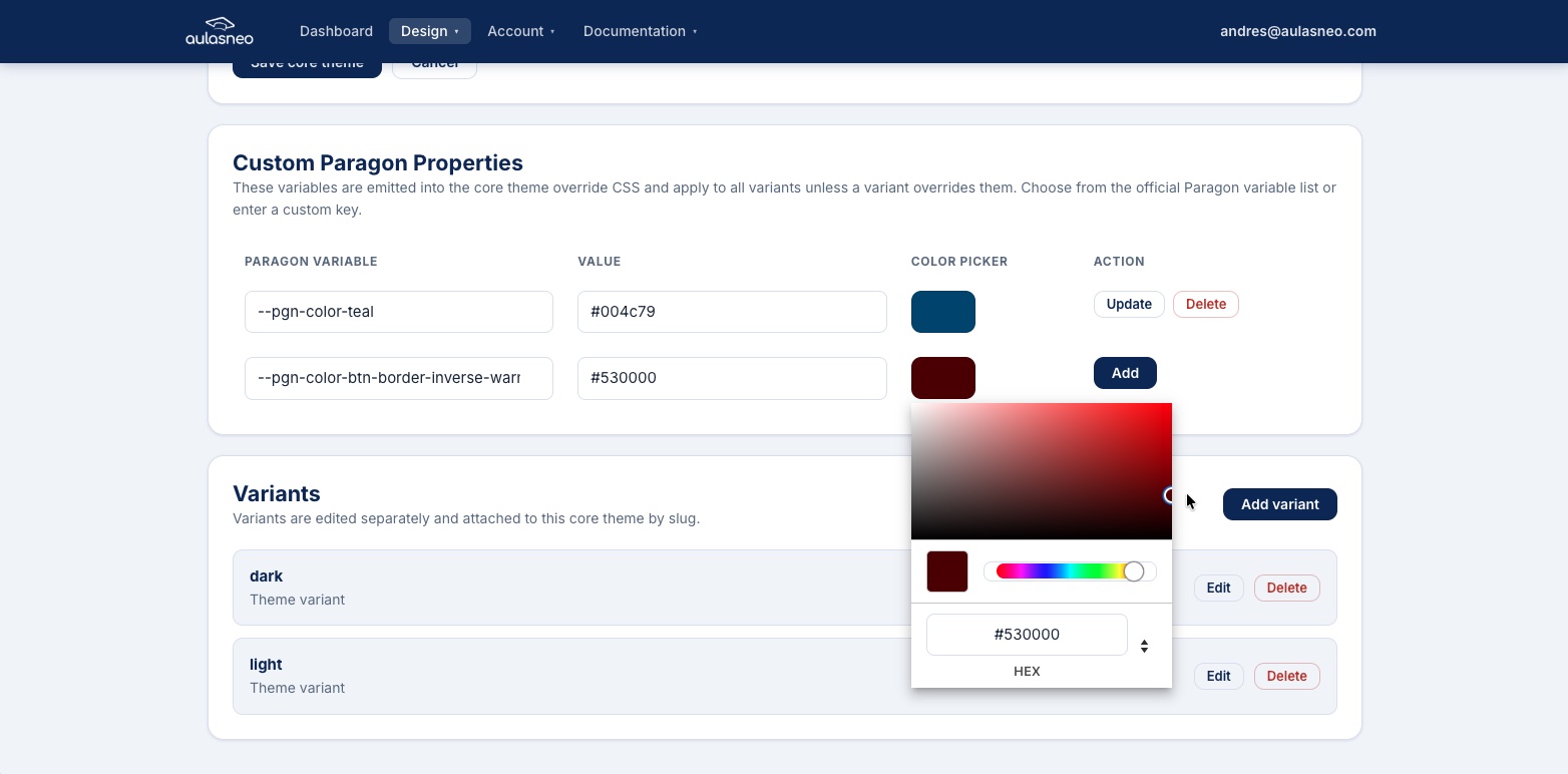
The custom properties editor provides autocomplete suggestions for all known Paragon variables and displays their default values.
Adding a Custom Property
Open the CSS theme or variant you want to modify.
Scroll to the Custom Paragon Properties section.
Click Add Property.
Begin typing any part of the variable name in the search field to see autocomplete suggestions. For example, typing
warningwill show all--pgn-*variables related to warning states.Select the variable from the suggestions list, or type the full variable name manually if it does not appear in the list.
Enter the desired value in the Value field (see Accepted Value Formats below).
Click Save.
Tip
The autocomplete list is populated from the official Paragon release bundled with the
version of Open edX you are targeting. If a variable you need is not in the list, you
can still add it manually — ensure it starts with --pgn- and follows the standard
naming conventions.
Accepted Value Formats
The value field accepts all CSS value types, including:
Hex color values:
#3a7bd5Named colors:
red,transparentRGB/RGBA functions:
rgb(128, 64, 0),rgba(0, 0, 0, 0.5)HSL/HSLA functions:
hsl(220, 70%, 50%)CSS variable references:
var(--pgn-color-primary-base)Numeric values with units:
1.5rem,4px,0.8Computed expressions (where supported by the browser):
calc(100% - 2px)
Understanding Variable Inheritance
Paragon variables form a hierarchy: many specific variables are defined as references to more general ones. Understanding this hierarchy helps you make changes efficiently.
For example:
--pgn-color-warning-baseis defined asvar(--pgn-color-yellow).--pgn-color-btn-text-outline-warningreferences--pgn-color-warning-base.--pgn-color-btn-focus-text-outline-warningand--pgn-color-btn-disabled-text-outline-warningalso reference--pgn-color-warning-base.
If you change --pgn-color-yellow, the yellow is updated everywhere, including in
all warning-related components. If you change --pgn-color-warning-base specifically,
you affect only warning components without changing other yellow uses. If you change
--pgn-color-btn-text-outline-warning directly, only that one component state is
affected.
Use the Style Map to explore these dependencies before making changes.
Scope: Theme vs. Variant Properties
Custom properties can be scoped to:
Theme level: The property is applied globally, across all variants. Use this for changes that should be consistent regardless of light/dark mode.
Variant level: The property is applied only within a specific variant. Use this to set different values for light mode versus dark mode.
A given property name can exist at the theme level and separately at one or more variant levels. The variant-level value takes precedence when that variant is active.
Editing and Deleting Properties
To edit a property, click on the property row in the Custom Paragon Properties table. Change the value and save.
To delete a property, click the Delete icon next to the property. Deleting a property causes the variable to revert to its Paragon default value.
Note
Changes to custom properties — including additions, edits, and deletions — are reflected after a hard browser refresh. No rebuild or service restart is required.